I have set this up to help me focus on specific tasks for e-portfolio building, for working to a professional capacity and reflecting on my work. I will use this to up-load examples of my work, so the world can see my creative ability. This will also allow for reflections on the work that I have created as well as inviting comments from peers in my group and other like minded creative people.
Friday, 29 January 2010
Tuesday, 12 January 2010
Identify the Roles of your Team
level editor defines and creates the interactive architecture for a segment of a game which includes the landscapes, the buildings and objects. They have to make sure that are true to the overall design specification, using the characters and the story elements defined by the game designer. They also develop the gameplay for a the level, which includes the challenges that the character must face and also the actions they must take to overcome them.
Ethan-Team leader, Lead Modeller -
The lead is the member of a development team that is in charge of everyone in that team. Their job is to oversee the game development in that particular department. They control the financial and other resources needed for a project and co-ordinate the work of the production team, making sure that the quality and vision of the game is maintained, whatever problems may arise.
Nat-Producer-
The producer is responsible for ensuring the successful delivery of the game, on time and within the budget.
Jack-QA-
A quality assurance technicians, or game testers, perform a vital role in game development by testing, tuning, debugging, and suggesting the detailed refinements that ensure the quality and playability of the finished game. Their job involves them playing a game and testing for bugs in the software
Lazer Baby Game Trailer Teamwork
My role in the team is to do character and environment design and modelling, animation and texturing. I am doing the environment modelling because that is my main strength.
Ethan's role in the team is the team leader, character/creature and environment design and modelling. Ethan's biggest strength is probably his concept art which is why he is doing the character design.
Jack's role in the team is creature concept art and creative ideas. Jacks strength is his creature concept art which is why he is doing the creature concept art for the team.
Nat's role in the team is character/creature design, creating textures and audio. Nat's strength is his photoshop ability which is why he is creating textures.
Friday, 27 November 2009
Items with lighting renders
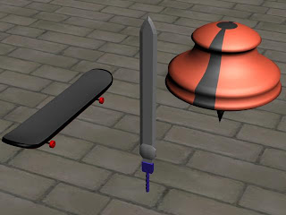 This is a render of my scene with anyout lighting at all.
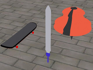 Here is a render of my scene with just the skylight.
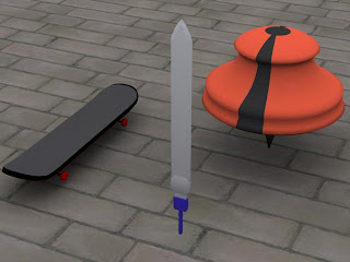 This render that has added shadows was made by using the advanced lighting-light tracer basic settings.
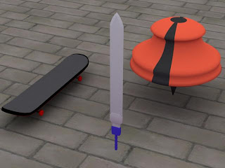 For this scene render I added 2 bounces and added a blue colour filter.
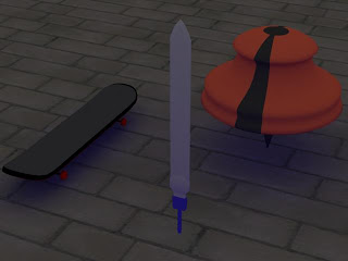 For this render I lowered the skylight intensity, added a purple colour filter and changed the extra ambient to blue.
 Here is my rendered scene after used the target spot lighting on it.
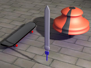 In this scene I just moved the target spot light a bit higher.
 Friday, 13 November 2009
Thursday, 25 June 2009
My Storyboard
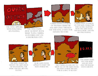
The character
The main character that I have chosen to feature in this trailer is my version of Beavis from ‘Beavis and Butthead’. He will be shown in the trailer in the middle few scenes fighting some alien ducks who are the main enemies in the trailer.
The middle part of the trailer zooms in on the destroyed city in more detail and shows the main character fighting a large amount of alien ducks. Throughout this part of the trailer there is a voice over telling the viewers a basic summary of the story which is that the Earth is under attack by alien ducks and the main character is the last hope for Earths survival. The rock music and punch sound effects are still playing throughout this part.
The last part of the trailer shows the main character defeating the group of alien ducks only to find that he is surrounded by thousands more. The main character says “this is going to fun” just before the screen blacks out showing text about when it will be released. In this part of the trailer, the music and sound effects stop just before the screen blacks out.
The environment shown throughout the trailer shows a destroyed city with a small amount of mist shown. The camera angle is mainly on the main character and the alien ducks.
For this assignment I was asked to come up with an idea and storyboard for a game trailer. The trailer had to contain my own character based on one of the characters in the 100 characters list.
The end product does match my original intentions almost exactly because I followed my original idea as much as I could. I think that my trailer that I have created looks quite a lot like my ideas which I am happy about.
The original audience for my product was 16 and above so I believe that it is appropriate. There is also nothing that is offensive in the product so it is not going to offend anyone.
During this assignment I have used Photoshop to neaten up my drawn storyboard and add colours to the scenes. I am alright at adding the colours but I think that I could work on easier and faster ways to use the different tools on Photoshop.
I created my storyboard by first drawing it on paper and then scanning it in to Photoshop. Because I drew the storyboard myself it doesn’t look as good as I wanted it to but for my first storyboard I think it is ok. The area I need to mainly develop is my drawing skill.
There was only one main problem that I encountered throughout this assignment which was my time keeping, this was due to me being unaware of how much time I had left until the final product had to be done. Throughout this experience I have learned how to draw a bit better and also how to use Photoshop more efficiently.
If I had the opportunity to do this product again I would do a lot more planning before hand and spend more time on the drawings for my storyboard. I am quite happy with my final product but I would be a lot happier if had a lot more detail in my storyboard.
Friday, 19 June 2009
Unit 64/65 evaluation
Pre-production
The first thing that had to do for this unit was come up with a story idea that I could make my 3d animation into. My story was about a character called Larry, who saves his neighbourhood from a crazed man called Screb, who was strapped to a bomb. I think that I could improve my idea if I put a lot more effort into the story and added a few more characters. After I came up with a story idea, I had to come up with designs for the characters in my animation, ideas for the location of the animation and then a storyboard. I also made a time schedule to help me manage my time better.

Larry, Screb, Screaming Women
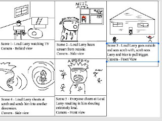
This is the storyboard that I made for my 3D animation.

Here is my time schedule.
Production
During the production of my 3D model I had to be aware of how much time I had left after I completed a part of my 3D model. While I was making my 3D model there was a few problems that I encountered such some 3ds Max closing before I could save work and also not knowing how to use certain tools. Before I made my 3D model and animation I had practice at making simple 3D models and animations like my tin man model and my bouncing ball animation as shown below:
Before I started making my 3D model, I drew my character in a front and side view (t-pose) to help me make the model. After I made the 3D model, I had to texture the model, which I found to be easy compared to other parts of the modelling; I then had to attach a bone structure, which I found to much harder than other parts of the modelling process. After I finished attaching bone structure, I had to attach the mesh to the bones through the skinning process and finally after this I had to animate the 3D model and then render it.

Final Product
Does the final product match your original intentions?
My final product does not match my original intentions because in my original plan I had more than one character and a proper story for the animation but because of problems with computers and programs I didn’t have as much time as I had hoped.
Is the end product appropriate for your intended audience?
The end product is appropriate for my intended audience because my intended was for both men and women who are aged 12 and above and there is nothing offensive with my model or its animation.
Discuss the technical aspects of your work and highlight the strengths/areas to develop?
I would say that one of my strengths in 3D modelling is the texturing of the models because I found it really easy to do and I never made a mistake when texturing. One of the areas that I need to develop is the actual modelling of a character and adding a bone structure. I found the bone structure difficult to add because I kept getting one of the bones wrong and also connected them badly a few times.
Discuss the content/style of your work?
My work is a 3D model of a man who I have modelled to look quite realistic.
Did you encounter any problems when creating the product? If so how were they resolved?
I encountered quite a few problems while I was creating my product, one of which was 3ds Max randomly closing down my work before I was able to save it. I resolved this problem by saving my work every couple of minutes. Another one of my problems was the bone structure going wrong and making my characters limbs bend funny. I resolved this problem by making sure the bones were properly aligned and connected properly.
What have you learnt from this experience?
From this experience, I have learnt how to use 3ds Max a lot better. I have learnt how to make character models, how to texture models, how to add bone structures and how to animate 3D models.
What skills have you developed through this process?
The skills that I have developed throughout this process are my skills on 3ds Max because I have learned how use a lot of the tools on the program. The main skill that I have developed the most throughout this process is creating a 3D model because I have learned how to make the models look better than when I started.
Did you have any problems with time management?
I did have a few problems with time management such as having to start my model again a few times because of 3ds Max randomly closing before I had the chance to save it. Other problems with time management was me not being aware of how much time I left so I ended up spending too much time on certain parts of the modelling.
If you had the opportunity to make this product again would you do anything different?
If I had the opportunity to do this product again I would manage my time more carefully, put a lot more effort into the modelling and animation process, add more characters in the animation and make the story a lot better.
Are you happy with the overall product?
I am quite happy with my final product because it was my first proper 3D model and animation that that I have done that contains a character. I would be a lot happier with it if I spent more time on it.
Tuesday, 16 June 2009
Icons Evaluation
Icons Evaluation
Unit 18 LO4
Summary
For this project I have designed and created an icon for each of the genres (War, sci-fi, horror, fantasy and humour)
What I have done
First of all I made a collage that had pictures related to the five genres as well as explanations to what they are. I have done research into icons and symbols such as the very first symbol to modern day interactive icons, the APPLE company such as their logo, past products and the interactive icons for their iPhone product. I have also done research into the different file formats so I could understand how they would be helpful.
I also went to the Bradford Animation Festival (BAF) to help with my research.
After this research, I did sketches in my sketch book to see what possible icons I could create for the five genres. For these drawings all I needed was a pencil and some coloured pens.
Then I made my final icons in Adobe Flash and Photoshop because the icons look slightly cartoon style when drawn in Flash and then I could add the final colour and effects in Photoshop.
Sci-Fi
This icon represents the Sci-fi genre and was made by doing line drawings over a photo of Jack. I used a photo from one of my other projects because I realised it would make a better icon for sci-fi. I added a purple outline to the icon because it makes it look a bit out of this world, a bit like an alien or ghostly. I made sure that when I was designing this icon, I didn’t offend Jack so I didn’t add anything to his head. This icon didn’t meet my original intentions because its different to my original ideas which were spaceships, which are sometimes associated with Sci-fi, but I think this turned out better than my original ideas.
To create this icon I first did a line drawing over a photo in Flash, then I copy and pasted the drawing into Photoshop to add the black background and purple outline.
If I had more time to design and create this icon I would make it better by doing more idea designs and spending more time on creating it.
Humour
This icon represents the humour genre because it is a funny looking man with amusing features. The colours I used aren’t always associated with humour but I have used them in a way that might be seen a funny. I made this by drawing a basic head shape and then adding bits on. This icon doesn’t offend anyone because I have been careful with how I designed it. This met my original intentions because it looks like one of my original ideas which were pictures of cartoon style people. I made this icon by drawing the face and colour in Flash and then adding the final effects in Photoshop.
I would improve this icon by making it more humourous looking and making the colours look better. If I had more time I would do more research into the humour genre.
Horror
This icon represents the horror genre and was made by drawing scary eyes and teeth on a black background. I used black and red because they are usually colours associated with horror. I have been careful not to make this scary because scary icons might offend people. This icon doesn’t meet my original intentions because it’s different to my original plans because my original drawings were of blood covered objects and weapons. I made this icon by drawing the eyes and teeth on a black background in Flash.
I personally don’t think that this Icon needs changing in any way but if I had more time I would do more research and more idea sketches.
Fantasy
This icon represents the fantasy genre because I it is a picture of a wizard which are usually associated with fantasy. I used the colours blue, red and silver because they are usually colours that a wizard would wear. This icon is not offensive in anyway because I was careful not to add anything offensive to it. This icon does not meet my original intentions because my original sketches for fantasy were of angels and fairies. I made this icon by drawing the picture and colour in Flash and then copy and pasting it into Photoshop to add effects to it.
I don’t think that this icon needs to be changed in any way because it looks perfect for fantasy but if I had more time to work on this icon I would spend more time on idea sketches.
War
This icon represents the war genre because it is a picture of a sword which were used in wars before guns were invented. I used silver because that is the colour of most metals used on weapons and I used the other colours because they make the icon stand out a bit. This icon might be offensive to people who don’t like weapons but I haven’t added any blood or guns which some people are most offended by. This icon met my original intentions because my original sketches had pictures of swords which is what I was aiming for. I made this icon by drawing the sword and adding colour in Flash and then copy and pasting it into Photoshop to add the final effects.
I think that I could make this icon better by making it look more war like and spending more time to make it look more detailed. If I had more time for this icon I would use it to do more research into the war genre and do more design sketches.
Evaluation
If I was to do this again, I would manage my time better by founding out what I need to do early and giving myself a good amount of time to get it done. Next time I would do a lot more research on the genres and do more idea sketches to give me a better choice of icon to create. I am happy with my sci-fi, horror and fantasy icons even though they aren’t what I originally intended but the two icons that do look like what I originally intended I think could look better because they look poorly made. I would make the humour and war icons better by doing more research and sketches.


 Here are two renders of the car I textured in 3DSmax by UVW text unwrapping the 3d model and then making the texture in Adobe Photoshop. Under the pictures of the model renders are the textures i made myself, with the exception of the serious cat.


