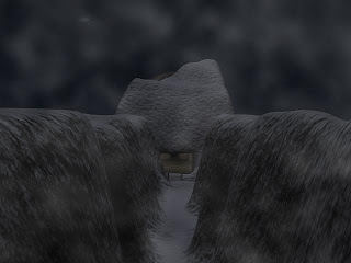
Here is the first basic concept idea that I came up with for a game logo, as you can see I just did a quick Photoshop job by adding a render of one of my trailer tests over the top of a blank Xbox 360 cover and then adding the text and logo. I think this concept is ok for an idea but it isn’t anywhere near professional enough to be a final game logo design.

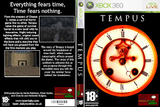
Here is the second concept idea that I came up with, which I prefer to my first idea because it looks a bit more professional made. For this concept I decided to make the back of the case as well the front to make it look more professional. I went with a clock for the front cover image because our game is based around time breaking down so using a clock seemed appropriate. On the back I used some of my renders to look like gameplay shots and then added some information which you would usually expect on the back of a game case.
Here is a video render of a 3d animation I made for the 3d game case model I made.


