In this evaluation, I will be discussing the work that I have done for unit 64/65, which includes pre-production, production and final product.
Pre-production
The first thing that had to do for this unit was come up with a story idea that I could make my 3d animation into. My story was about a character called Larry, who saves his neighbourhood from a crazed man called Screb, who was strapped to a bomb. I think that I could improve my idea if I put a lot more effort into the story and added a few more characters. After I came up with a story idea, I had to come up with designs for the characters in my animation, ideas for the location of the animation and then a storyboard. I also made a time schedule to help me manage my time better.
Larry, Screb, Screaming Women
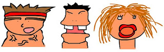
Here are pictures of my original character designs
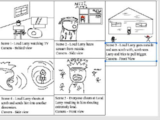
This is the storyboard that I made for my 3D animation.

Here is my time schedule.
Production
During the production of my 3D model I had to be aware of how much time I had left after I completed a part of my 3D model. While I was making my 3D model there was a few problems that I encountered such some 3ds Max closing before I could save work and also not knowing how to use certain tools. Before I made my 3D model and animation I had practice at making simple 3D models and animations like my tin man model and my bouncing ball animation as shown below:

Before I started making my 3D model, I drew my character in a front and side view (t-pose) to help me make the model. After I made the 3D model, I had to texture the model, which I found to be easy compared to other parts of the modelling; I then had to attach a bone structure, which I found to much harder than other parts of the modelling process. After I finished attaching bone structure, I had to attach the mesh to the bones through the skinning process and finally after this I had to animate the 3D model and then render it.

Final Product
Does the final product match your original intentions?
My final product does not match my original intentions because in my original plan I had more than one character and a proper story for the animation but because of problems with computers and programs I didn’t have as much time as I had hoped.
Is the end product appropriate for your intended audience?
The end product is appropriate for my intended audience because my intended was for both men and women who are aged 12 and above and there is nothing offensive with my model or its animation.
Discuss the technical aspects of your work and highlight the strengths/areas to develop?
I would say that one of my strengths in 3D modelling is the texturing of the models because I found it really easy to do and I never made a mistake when texturing. One of the areas that I need to develop is the actual modelling of a character and adding a bone structure. I found the bone structure difficult to add because I kept getting one of the bones wrong and also connected them badly a few times.
Discuss the content/style of your work?
My work is a 3D model of a man who I have modelled to look quite realistic.
Did you encounter any problems when creating the product? If so how were they resolved?
I encountered quite a few problems while I was creating my product, one of which was 3ds Max randomly closing down my work before I was able to save it. I resolved this problem by saving my work every couple of minutes. Another one of my problems was the bone structure going wrong and making my characters limbs bend funny. I resolved this problem by making sure the bones were properly aligned and connected properly.
What have you learnt from this experience?
From this experience, I have learnt how to use 3ds Max a lot better. I have learnt how to make character models, how to texture models, how to add bone structures and how to animate 3D models.
What skills have you developed through this process?
The skills that I have developed throughout this process are my skills on 3ds Max because I have learned how use a lot of the tools on the program. The main skill that I have developed the most throughout this process is creating a 3D model because I have learned how to make the models look better than when I started.
Did you have any problems with time management?
I did have a few problems with time management such as having to start my model again a few times because of 3ds Max randomly closing before I had the chance to save it. Other problems with time management was me not being aware of how much time I left so I ended up spending too much time on certain parts of the modelling.
If you had the opportunity to make this product again would you do anything different?
If I had the opportunity to do this product again I would manage my time more carefully, put a lot more effort into the modelling and animation process, add more characters in the animation and make the story a lot better.
Are you happy with the overall product?
I am quite happy with my final product because it was my first proper 3D model and animation that that I have done that contains a character. I would be a lot happier with it if I spent more time on it.
 This is a render of my scene with anyout lighting at all.
 Here is a render of my scene with just the skylight.
 This render that has added shadows was made by using the advanced lighting-light tracer basic settings.
 For this scene render I added 2 bounces and added a blue colour filter.
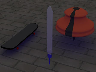 For this render I lowered the skylight intensity, added a purple colour filter and changed the extra ambient to blue.
 Here is my rendered scene after used the target spot lighting on it.
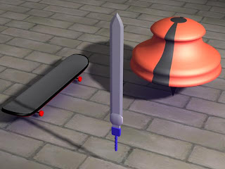 In this scene I just moved the target spot light a bit higher.


